The first aesthetics update


I've spent some time making everything slightly more polished to look less like a freshly started Unreal project. Only slight gameplay changes.
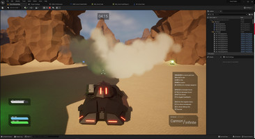
UI and Menus
- Implemented a cropped corner button.
- I added a simple mesh to the main menu map; we are inside a hangar now.
- Map and game mode selector dropdowns are better styled.
- New Player Shield and Health bar design
- Tank HUD elements get cropped background
- Weapon Switching buttons are indicated on the active weapon box ([1]–[2])
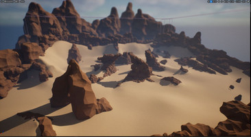
Desert Ramps map
I've created 2 rock meshes in Blender and then, as an experiment, I've tried placing these two meshes everywhere to see if they look any good. I've barred the edges of the map and then begun partitioning the level with the rocks. My primary objective was to make the center part a true four-way intersection and block passage through the inner pillars. When I was done, I wanted to create some noteable landmarks on the corners so players can immediately tell which corner they spawned in. Lastly, I've placed some health and shield pickups all over the place.
FX and gameplay
- The Shield pickup is a new blue pickup that maxes out current shields.
- I've created a new, non-emmissive version of the default sprite material provided by Unreal and used this to recreate every smoke FX, from the Tanks burning through the rocket's smoke trail, right up to the smoke grenade's effect. It actually looks quite okay, especially if a smoke effect is going on at the intersection of a shadow and a lit space.
- DM and TDM games are now 5 minutes long.
Get Hover Tanks
Hover Tanks
An Unreal Engine 5 demo project
| Status | Prototype |
| Author | attilah |
| Genre | Action |
| Tags | Low-poly, Multiplayer, Tanks, Third Person, Unreal Engine |
| Languages | English |
More posts
- Sprinkling GAS on Hover TanksFeb 29, 2024
- Road to the first playtestJan 12, 2024
Leave a comment
Log in with itch.io to leave a comment.